The header of a website is likely to be the first thing people will look at when they visit your site. This post introduced three design aspects to consider when designing website header.
1. Keep it simple. This aspect could bring with clarity,trust,meaning.
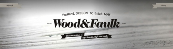
A simple header can convey trust. For example, Wood&Faulk use very few elements in their header, focussing on their logo with two brief slogans. This sacrifice of visual elements or other content puts the company on a pedestal. Only their name and a two lines of text are needed to create an identity and convince the visitor of their high quality products.
2. Add some art so it could bring with attention,appeal,professionalism.
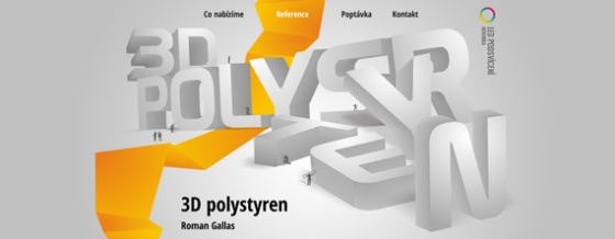
This header is an example for attention. the site 3D Polystyren works with a very nice 3D illustration of their name to create a sort playground for a bunch of little figures who either stand around the letters, on top of them, or try to climb them. The illustration itself doesn’t carry a specific message, but makes you curious to see what else the site has to offer.
3. Make it interactive. It’s could bring users with engagement, fun,personality.
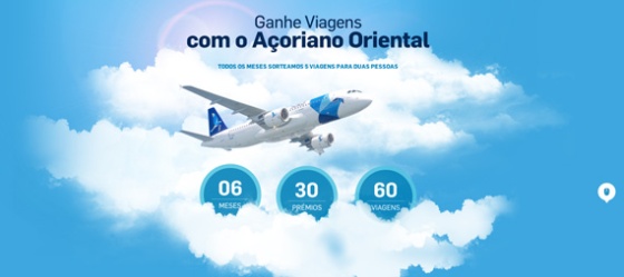
Interactive elements can be very engaging for your website visitors. For example Açoriano Oriental use a parralel scrolling effect on their site, letting the airplane fly through the clouds while you scroll down the page. The header becomes an integrated part of the website and invites the visitors to enter the site in a very engaging way.
Want to see more example? Click on the address!
http://blog.usabilla.com/how-to-design-a-more-effective-website-header/